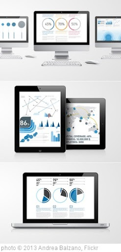
Infographics are visual representations of data design to help communicate information clearly. They are great for English Language Learners, and the rest of us, too! The information can also be either serious or humorous.
To see examples of some of the best ones, you can visit:
You can find even more at The Best Sources For Interactive Infographics and A Collection Of “The Best…” Lists On Infographics.
Of course, you don’t need online resources to have students create their own infographics that can be used towards achieving numerous learning outcomes, as I recently posted about at What A Great Infographic To Use As A Model For Students.
However, creating them online can also be both useful and fun — for both teachers and students.
Here are my choices for The Best Resources For Creating Infographics:
I’m going to start-off with some of my previous “The Best…” lists, including:
The Best Resources For Learning About “Word Clouds”
Not “The Best,” But “A List” Of Mindmapping, Flow Chart Tools, & Graphic Organizers
The Best Tools To Make Simple Graphs Online
The Best Sites For Learning About Cartograms
The Best Map-Making Sites On The Web
The Best Posts To Help Understand Google’s New “Books Ngram Viewer”
Cool New Word Visualization Tool!
And here are resources from other sites:
Make Your Own Infographic from the Wild Apricot blog.
5 Unbeatable Types of Infographic + Free Tools to Create Them comes from The Search Engine Journal.
10 Awesome Free Tools To Make Infographics is from The Make Use of blog.
Teaching With Infographics | A Student Project Model from The New York Times Learning Network.
I posted about a site called Daytum two years ago — before it opened for the public. It’s a super-easy tool to use to visual any kind of data, though its primary purpose for people to use it to keep track of personal data. I had forgotten about it until I saw an article in The New York Times — Illustrating Your Life in Graphs and Charts — that mentioned it. I’m adding Daytum to list.
Create A Better Life Index lets you, without having to register, create an infographic emphasizing the qualities that you believe are key for a “better life” and showing how different countries in the world are doing in those areas. You can then your infographic with others. It’s from the Organisation for Economic Co-operation and Development (OECD).
I also have to mention the new website Visual.ly, which began year and is a source of great infographics and new tools to easily create them. .
A Few Rules for Making Homemade Infographics comes from The Atlantic.
Creating Infographics with Students is from Langwitches.
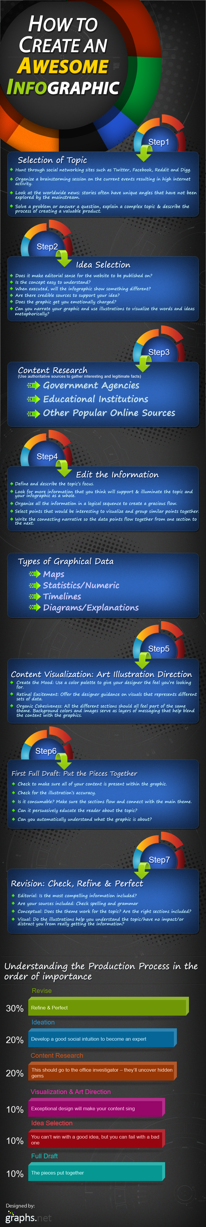
The Anatomy Of An Infographic: 5 Steps To Create A Powerful Visual is a useful outline.
Thanks to Nik Peachey, I’ve learned about Easel.ly , which is hands-down the easiest tool I’ve seen on the Web to create infographics. You just “drag-and-drop” a variety of themes, type in your data, and you’ve got a great infographic.
Infogr.am looks like a pretty easy tool for creating infographics that can be linked to or embedded. The selection of templates is pretty limited, but the site is still in beta. The main problem with the site is that you can only log-in using a social media site like Facebook or Twitter. That makes it usable for teachers, but, since those sites are blocked in most schools for students, they would not be able to create their own.
Venngage is the newest easy tool for creating online infographics. Like several other sites on list, it has a number of templates where you just add your info, click publish, and you get an embeddable image.
Through Silvia Tolisano, I recently learned about a very creative idea of using concrete objects to make infographics. You can find out more about idea at:
Creating Infographics: Making Numbers Sing
A Kit For Creating Homemade Real-World Infographics, Using Balloons And Wood
8 Steps to Create an Infographic is a useful infographic.
Innovative educators use infographics to engage learners is a post from The Innovative Educator.
The Jet Propulsion Laboratory of NASA has a site called JPL Infographics where you can find a bunch of great…infographics. But what’s even better is that it’s set up for people to create their own, too.
Teaching With Infographics is from the Aside Blog.
Infographics: Round 2 is from Joyce Valenza.
Visme is a new free online tool for creating online presentations, animations and — at least in my mind — most importantly, infographics. Most of the options on the site all look impressive but, for my technologically incompetent tastes, are just slightly more complicated than I would like (though I’m sure they all would be fine for most readers of blog). I, though, particularly like their infographic tool. They just did a huge update in 2016.
Creating Infographics With Your Students is by Silvia Rosenthal Tolisano.
infographics provides a pretty decent guideline for making good infographics:
Beyond the Book: Infographics of Students’ Reading History is from Edutopia.
5 Tools For Creating Your Own Infographics is a post from Read Write Web.
With one exception, it doesn’t any new tools that aren’t already on list and, in fact, misses quite a few. However, for the sites it does cover, it gives great overviews with nice screenshots. You probably won’t find a better overview of them anywhere.
Robin Richards – What Makes an Infographic Cool?
The Guardian has published a slideshow of 16 useless infographics which also includes short explanations about what is wrong with each one.
It’s a perfect teaching tool to use prior to having your students create an infographic, which is why I’m adding it here.
A recent study was published identifying what elements make an infographic more memorable. Here’s an excerpt from an article on the study:
“A visualization will be instantly and overwhelmingly more memorable if it incorporates an image of a human-recognizable object—if it includes a photograph, people, cartoons, logos—any component that is not just an abstract data visualization,” says Pfister. “We learned that any time you have a graphic with one of those components, that’s the most dominant thing that affects the memorability.”
Visualizations that were visually dense proved memorable, as did those that used many colors. Other results were more surprising.
“You’d think the types of charts you’d remember best are the ones you learned in school—the bar charts, pie charts, scatter plots, and so on,” Borkin says. “But it was the opposite.”
Unusual types of charts, like tree diagrams, network diagrams, and grid matrices, were actually more memorable.
“If you think about those types of diagrams—for example, tree diagrams that show relationships between species, or diagrams that explain a molecular chemical process—every one of them is going to be a little different, but the branching structures feel very natural to us,” explains Borkin. “That combination of the familiar and the unique seems to influence the memorability.”
8 Types Of Infographics & Which One To Use When is a useful series of…infographics.
Introduction To Infographics is from the infographic-creator Piktochart, but the information it contains is useful for making any kind of infographics.
If you want people to remember your chart, include a dinosaur is from the Boston Globe.
Canva is a new tool for creating infographics. You can learn more about it at Richard Byrne’s blog. An Easy Guide to Creating a Presentation in Canva is from the Canva blog. Canva Adds New Awesome New Features! is from Richard Byrne.
The Secrets Of A Memorable Infographic is from Co Design.
How to Make Your Own Infographic from Razor Social.
14 Great Tools to Create Engaging Infographics and Images for your Social Media Posts is from Buffer.
I learned about Visage, a new tool for creating infographics, from The Why Axis. Here’s a video about it:
NY Times Creates Their Own Version Of Google’s Ngram Viewer
Now Yelp Creates THEIR Own Version Of Google’s Ngram Viewer
Inventing Infographics: Visual Literacy Meets Written Content is from Edutopia.
Telling Stories With Data and From Article to Infographic: Translating Information About ‘Sneakerheads’ are both NY Times Learning Network lessons on using infographics.
The Best Tools For Creating “Word Frequency Charts” For Books, Articles & Movies
How Real Kids Create Real Infographics is from Ed Surge.
A lesson framework for getting learners to prepare and present infographics is from Adam Simpson.
5 Great Online Tools for Creating Infographics is from Cool Infographics.
Canva for Education – Lesson Plans Incorporating Visuals Across the Curriculum is from Richard Byrne.
The Educators’ Guide to Infographics is from The Edublogger.
Teaching Materials From Canva looks pretty useful.
Media Make #3: Argue with Images! Infographics is from KQED.
I learned about Genial.ly from Shelly Terrell’s excellent post, Visualizing Learning with Infographics: 23 Resources. Genial.ly seems like a new and useful free tool for creating infographics. I’ve embedded a video about it below, though it’s more flash than substance (the video, that is):
Tools To Create Infographics is a useful article from Voice Of America.
Eureka Alert has published a summary of a study on what makes a successful infographic.
Google Sheets now uses machine learning to help you visualize your data is from TechCrunch.
Raw Shorts lets you easily create…short videos.
SankeyMATIC lets you easily build a Sankey diagram builder. No, I don’t really understand what it is, either, but it’s apparently a popular and respected kind of infographic.
12 Visual Hierarchy Principles Every Non-Designer Needs to Know is from Visme.
Teaching with Infographics: A Modern Approach to Posters is by Tan Huynh.
Flourish looks like a good new site for creating infographics. Flourish has now added an audio feature to use when you create infographics.
Data Wrapper is a new site that lets you create interactive charts and graphs. Here’s a good explanation of how to use it.
Snappa and BeFunky offer infographic-creating templates.
Excited to release https://t.co/tz5rUFBJOC! DIVE makes data exploration more accessible with semi-automated data visualization and analysis features, integrated into a single system.
Video: https://t.co/ZqJhl6im1D
Paper: https://t.co/uJ1rxlXb1HCreated @CollectiveMIT @medialab pic.twitter.com/sIZLcj8LKs
— Kevin Hu (@kevinzenghu) June 19, 2018
STEM Literacy Infographics has a ton of resources.
You can create animated video versions of infographics with Animaker.
How to Create Charts and Graphs in Google Docs is from Richard Byrne.
I’ve previously posted about Biteable but, since that time, they’ve added the ability to create infographics.
#Infographics are great communication tools as they deliver information quickly, efficiently, and in an aesthetically pleasing package.
But creating them is hard. @columnfive‘s guide is a must read if you are planning to create awesome infographics.https://t.co/fe7MIRwWq9 pic.twitter.com/K6W3pvCjCx
— Twigdoo HQ (@twigdoo) January 14, 2019
Digest that data! 📊 #Infographic design is the most effective way to present data visually. Let’s take a step-by-step look into how to make an infographic… https://t.co/nrIsDo45UT
— Canva (@canva) January 17, 2019
Check out Visual Vocabulary.
I’ve previously shared some of the neat NY Times “You Draw It” charts. Flowing Data shares those links, and they also share a new tool that lets anyone make their own.
How to Master Data Visualization
Thanks to Technology Tidbits, I learned that you can use StoryboardThat for creating infographics.
This looks interesting: Grid raises $12M Series A to turn spreadsheets into visual ‘narratives’ is from TechCrunch.
Charttt lets you easily make…charts.
Adobe Spark lets you create infographics.
Prezi seems to have increased the number of design tools it offers, including now providing the ability to create infographics.
Easil is sort of like Canva. You can make infographics and more with it.
Grafico is a new tool for creating infographics.
Make interactive charts with Word Stream Maker, and learn more about it here.
How to use Datawrapper to make fast—and free—visualizations is from Fast Company.
Bento lets you create visualizations of lots of education data.
Google’s Journalist Studio has lots of visualization tools, and you don’t have to be a journalist to use them.
Make Your Own Infographic Revisited is from Express Yourself in English.
Vista Create is sort of a Canva “lite.”
Drawify lets you use AI to create infographics and other visuals.
THE PIKTO CHART “AI-POWERED INFOGRAPHIC GENERATOR” WILL RIGHTFULLY BE A POPULAR TOOL
Vizzy uses AI to create infographics.
Animstats turns statistics into animated videos.
Feedback is welcome.
If you found post useful, you might want to consider subscribing to blog for free.
You might also want to explore the nearly 600 other “The Best…” lists I’ve compiled.


I came across this post while doing a web search for help with creating infographics. It must have taken you a long time to compile such an extensive resource list. I’ll put the information on this article to good use.
Larry, YOU ROCK! I have never seen such an exhaustive, informative, totally awesome post regarding infographics. I will most certainly put your information to good work. Thanks for sharing so freely.
Glad you found it useful!