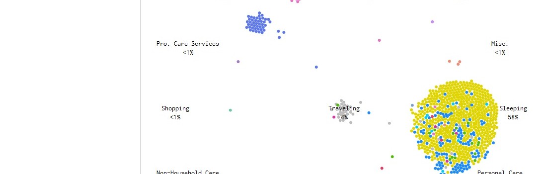
I regularly collect visualizations of data showing how Americans spend their time. You can see them all at The Best Visualizations Of How People Spend Their Days (which also includes some describing how we spend our money, too).
Students find them interesting, and they create great opportunities for compare/contrast analysis, especially when the visualizations differentiate between gender, age, ethnicity, etc.
Flowing Data has just developed three new visualizations of the most recent data, all of which are pretty neat.
Instead of describing the details of how they’re different, I’ll just list their titles with live links. They’re all worth a visit:


Recent Comments