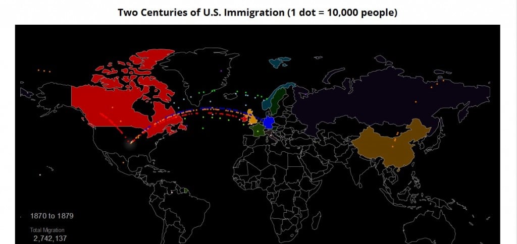
Metrocosm has created a nice interactive visualizing immigration to the United States over the past two hundred years, including showing countries of origin.
Unfortunately, it only shows people who “obtained lawful permanent resident status,” so neither slaves from Africa who were forced to come or undocumented immigrants from other countries are not included. It seems odd that they wouldn’t point out that omission.
I’m adding it to The Best Sites For Learning About Immigration In The United States.
Thanks to Google Maps Mania for the tip.


Recent Comments