I’ve been sharing an infographic or two each week, and you can find previous ones here.
You might also be interested in all my “Best” lists on infographics.
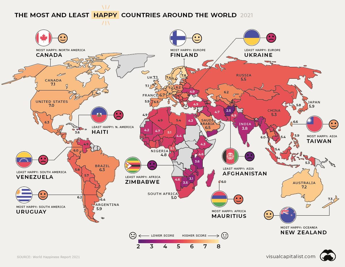
Here’s my latest pick, Mapped: Global Happiness Levels in 2021, is from Visual Capitalist. You can find more information on it – and a bigger version – at the link. The info there, I think, is particularly interesting, including an explanation of how happiness is measured.
I’m adding this infographic to The Best Sites To Learn About…Happiness?


Recent Comments