I’ve been publishing an “infographic of the week” for awhile, and you can see them all here.
This one is from Visual Capitalist, and you can see a bigger version with more information there.
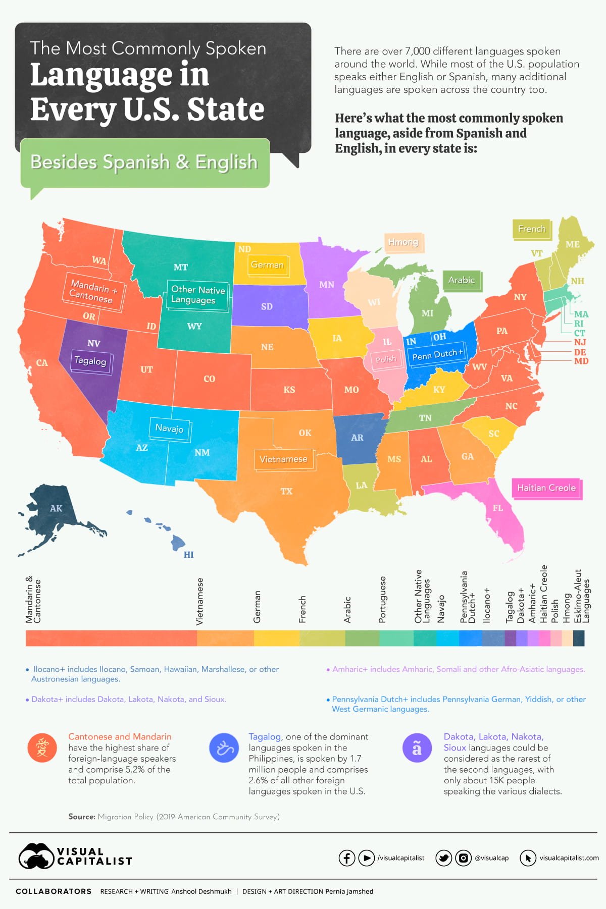
I’m adding this to The Best “Language Maps”
I’ve been publishing an “infographic of the week” for awhile, and you can see them all here.
This one is from Visual Capitalist, and you can see a bigger version with more information there.
I’m adding this to The Best “Language Maps”


Recent Comments