Here are my choices for The Best Sites For Learning About Nuclear Weapons:
The Best Resources For Learning About The Atomic Bombings Of Japan
Nuclear Arms Reduction Infographic
An infographic showing Nuclear Explosions Since 1945
New Scientist has a map showing countries with nuclear weapons.
Nuclear Armed World is an impressive interactive from CBS News.
Capturing The Atom Bomb On Film is a New York Times slideshow of some pretty spectacular photography from early atom bomb tests. It’s from The New York Times.
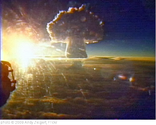
When We Tested Nuclear Bombs is a series of photos from The Atlantic.
Nuking My House On Line (You Can, Too) is from NPR, and tells about a site where you can simulate the damage a nuclear bomb would cause anyplace in the world.
America’s nuclear guinea pigs: Astonishing film that shows how Marines were used to test atomic weapons is from The Daily Mail.
A ground zero forgotten: The Marshall Islands, once a U.S. nuclear test site, face oblivion again is from The Washington Post.
Bomb Blasts is a new interactive tool that – in terrifying detail – lets you see the impact a nuclear bomb blast would have anywhere in the world, including in your neighborhood. It also shares information on how the public can learn more about how to reduce the risk of their use.
 You will find more infographics at Statista
“Can you survive nuclear fallout?” is the topic of a new TED-Ed video and lesson:
 You will find more infographics at Statista
A nuclear attack would most likely target one of 6 US cities. Simulated images show how a Hiroshima-like explosion would affect each. is from Business Insider.
Which Countries Have the Most Nuclear Weapons?, is from Visual Capitalist. You can find more information on it – and a bigger version – at the link:
![]()
 You will find more infographics at Statista
Infographic Of The Week: “The Science of Nuclear Weapons, Visualized”
This is interesting – New York City has put out a PSA of what to do in case of a nuclear attack:
Humanity is closer to self-destruction than ever before is an interesting infographic.
70 years ago, an H-bomb test went awry. We must never forget the fallout. is from The Washington Post.
 You will find more infographics at Statista
Feedback and suggestions are welcome!
If you found this post useful, you might want to consider subscribing to this blog for free.
You might also want to explore the 400 other “The Best…” lists I’ve compiled.


Recent Comments