I’ve been sharing an infographic or two each week, and you can find previous ones here.
You might also be interested in all my “Best” lists on infographics.
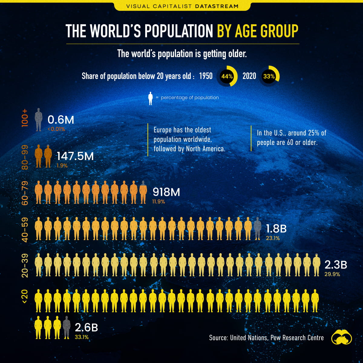
Here’s my latest pick, Visualizing the World’s Population by Age Group, from Visual Capitalist. You can find more information on it – and a bigger version – at the link.
I’m adding it to The Best Resources For Learning About Our World’s Population Of 7 Billion.


Recent Comments