The seven billionth person in the world is projected to be born on Monday, and I thought that this event called for a “The Best…” list.
Here are my choices for The Best Resources For Learning About Our World’s Population Of 7 Billion:
A global push to 7 billion people is a Washington Post interactive.
Population Seven Billion is a photo gallery from The Atlantic.
Population to Hit 7 Bllion on Halloween is from Breaking News English.
How big was the world’s population when you were born? is an interactive from The Guardian.
Fear of a 7 Billion Population Planet is from The Atlantic.
The upsides of overpopulation is from The Washington Post.
World Population: 7 Billion is a photo gallery from The Boston Globe.
The making of 7 billion is a Washington Post slideshow.
Visualizing How A Population Grows To 7 Billion is from NPR.
Making Sense of 7 Billion People is from Wired.
Bringing Up the Issue of Population Growth is from The New York Times.
Feeding 7 billion and our fragile environment is a photo gallery from The Boston Globe.
Population Control, Marauder Style is a really interesting infographic from The New York Times.
Do the dead outnumber the living? is from The BBC.
I’ve previously shared videos of Hans Rosling, data magician.
He has a new TED Talk out, and it’s called Religions and Babies. I’m embedding it below:
Young Vs Old: Which Countries Have The Youngest Populations? is an interactive from Radio Free Europe.
World Population History has a very impressive interactive that traces the world’s population over the past two-thousand years. It not only highlights where population decreases or increases occurred, but also provides explanations behind the changes.
They also have created a less interesting, though still useful, video summary of that same history:
I learned about these resources from Vox, which also provides more detailed descriptions of them.
Demography Is Destiny? Teaching About Cause and Effect With Global Population Trends is from The New York Times Learning Network.
Here’s how this next video’s creators describe it:
The estimated demographic makeup of the World from 1950 to 2090. The top graph displays overall population, whilst the bottom is a league table of the ten most populous countries.
“The Human Reach” Is A Good Interactive On The World’s Population
 You will find more infographics at Statista
A 3D Look at the Largest Population Density Centers is from Visual Capitalist.
The World Population in 2100, by Country is also by Visual Capitalist.
Visualizing the Most Populous Countries in the World is from Visual Capitalist.
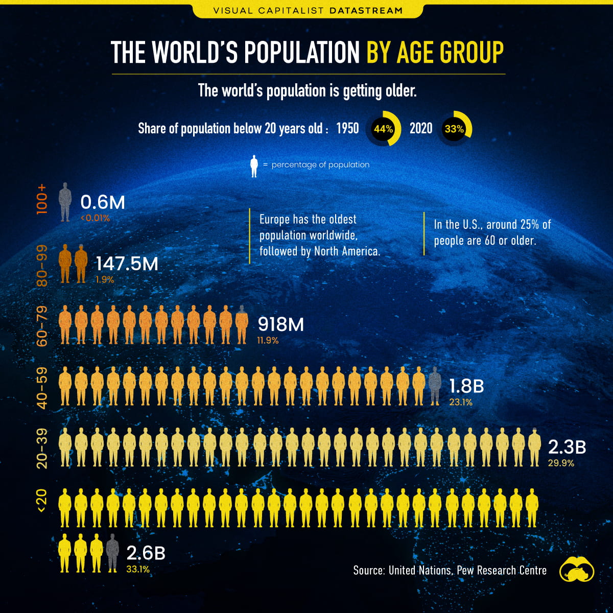
Visualizing the World’s Population by Age Group, from Visual Capitalist. You can find more information on it – and a bigger version – at the link.
Infographic Of The Week: “The World Population in 2100, by Country”
Population Boom: Charting How We Got to Nearly 8 Billion People is from Visual Capitalist.
After you input some data about yourself into Population.io, it will show you a lot of different info about how you fit into the world’s population, including how your age and life expectancy compare to others.
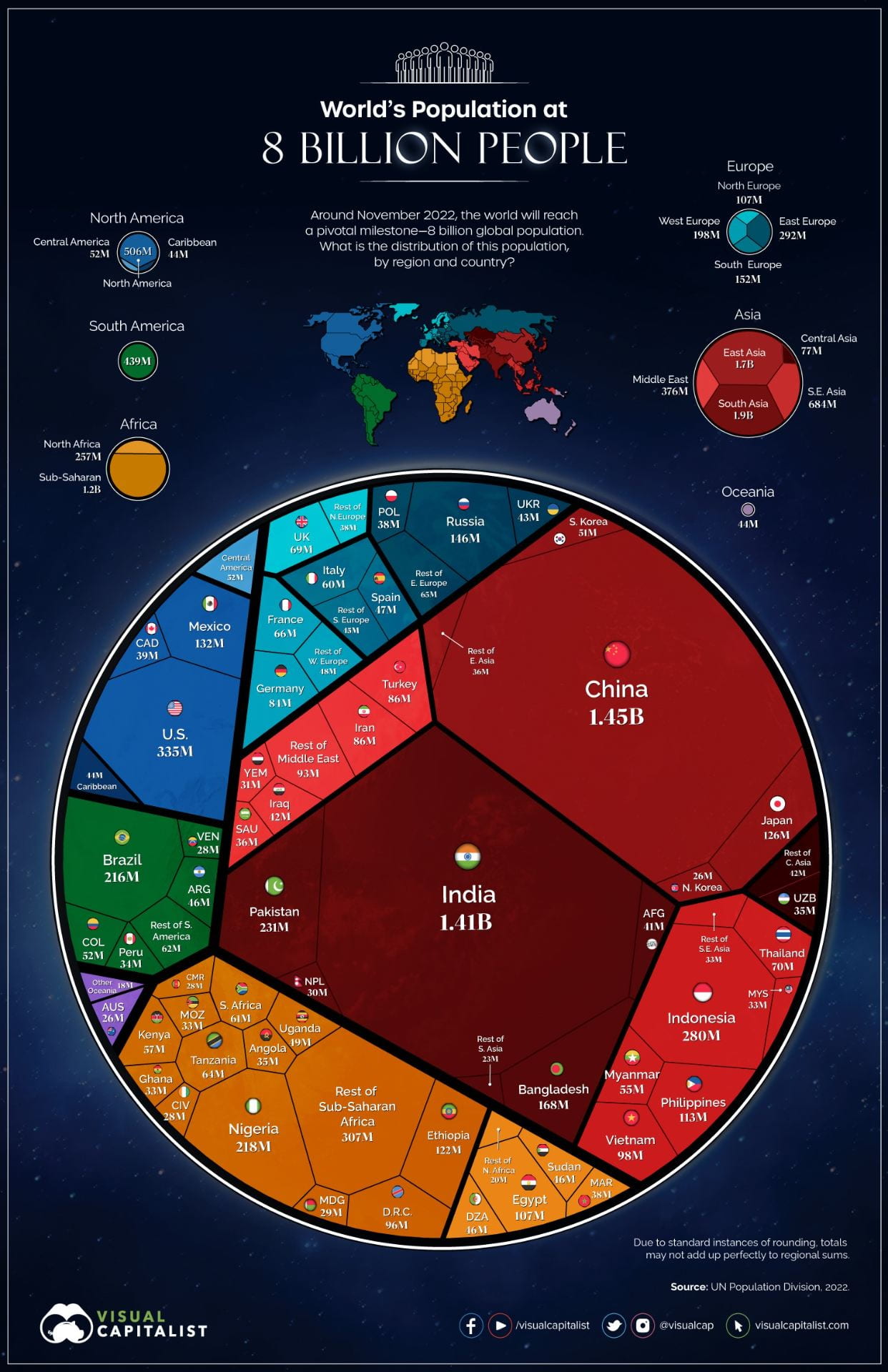
The above nifty infographic comes from Visual Capitalist and, if you go to its direct link, they have similar ones breaking down the populations of continents by countries.
Infographic Of The Week: “The World’s Most Populous Countries (1973–2023)”
You’re one in 8 billion is from The Washington Post.
How has the world’s population grown since 1950? is from The Guardian.
Watch How World’s Population Rose From 3 Billion in 1960 to 8 Billion in 2022
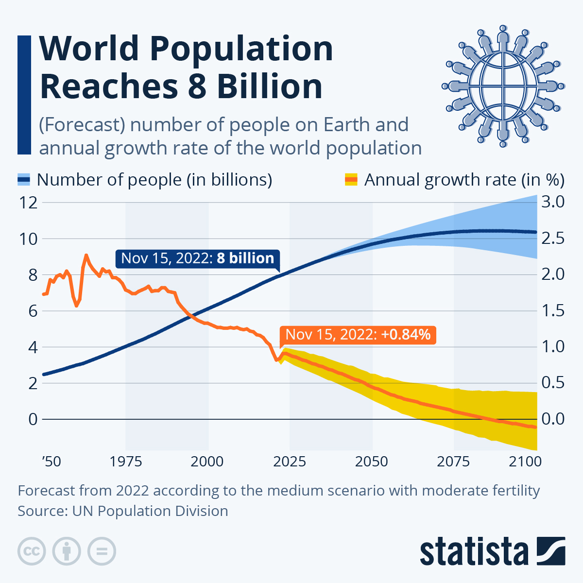 You will find more infographics at Statista
 You will find more infographics at Statista
Infographic: “Comparing Population Pyramids Around the World”
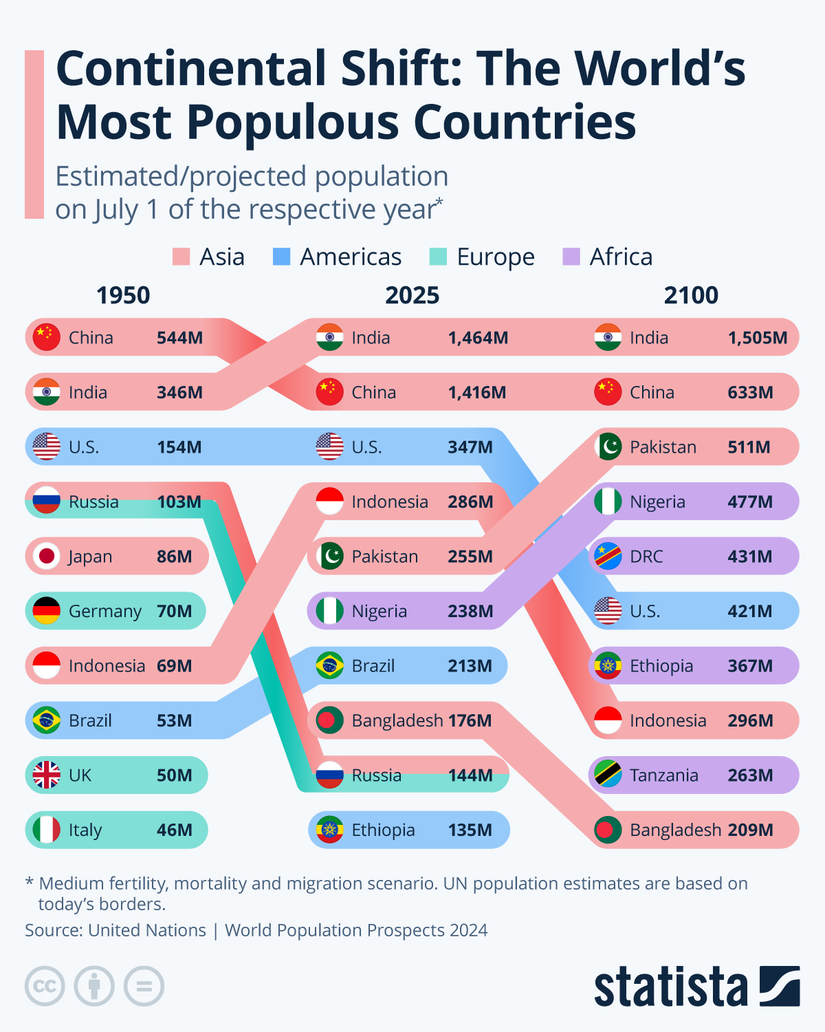 You will find more infographics at Statista
New on @nytimes: “How a Vast Demographic Shift Will Reshape the World” https://t.co/XqhHcGLGWt
— Interactive Journalism (@InteractiveFeed) July 16, 2023
In Opinion
During your lifetime, we may hit the peak of global human population growth. After that, humanity could begin an unprecedented decline, writes an economist. https://t.co/MpkGPi4ksH
— The New York Times (@nytimes) September 23, 2023
INFOGRAPHIC: “MAPPED: POPULATION GROWTH BY REGION (1900-2050)”
INFOGRAPHIC: “VISUALIZING THE SIZE OF THE GLOBAL SENIOR POPULATION”
INFOGRAPHIC: “POPULATION PROJECTIONS: THE WORLD’S 6 LARGEST COUNTRIES IN 2075”
World Population Flags is a very unique way to display the populations of countries around the world.
If you found this post useful, you might want to consider subscribing to this blog for free.
You might also want to explore the 800 other “The Best…” lists I’ve compiled.




Trackbacks/Pingbacks