Here are four ways that show global warming over the years. I’ll be adding them to The Best Sites To Learn About Climate Change.
I also wonder, though, if these might serve as models for another kind of assignment.
At the end of a semester, sometimes I’ll ask students to envision their time metaphorically and have them draw themselves at the beginning of the year and then draw themselves now. It’s always a pretty interesting reflective exercise.
I wonder if these four global warming examples could be used as models for asking students to represent their own semester in other innovative ways– giving them the options of doing it musically (I think people could do it without any musical talent), via a chart, or through a video, accompanying it with a text and verbal reflection. Just a thought — I invite your reactions….
This first video is from NASA:
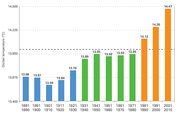
Here’s a chart from the World Meteorological Association (and here are ten other charts on global warming):
And here are two musical compositions developed to reflect temperature increase over the years. The first is from The Lawrence Livermore National Laboratory, and the second is from Daniel Crawford, a student from the University of Minnesota.
Let me know if you have suggestions for other ways to represent the changing climate, or comments on my ideas on how to use this as a lesson in other classes, too.


Recent Comments