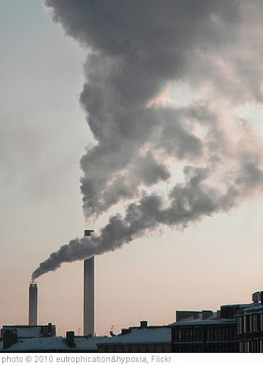
The earth’s non-renewable resources are not going to last forever (hence, the reason for calling them “non-renewable”). Here are some interactives that show long each one has left:
Global resources stock check is from The BBC.
This chart is described as “Our chart for this week takes a look at how far a year’s worth of natural resources goes given human consumption….In 1970 global consumption of natural resources just about matched the number of resources the Earth produced in a year. December 29th was the day in 1970 that global consumption ate up a year’s worth of resources. By 2018, a year’s worth of natural resources was consumed by August 1st. That means that in 2018 it took nearly two years of natural resources that the Earth naturally produced to match the amount people around the world consume in a single year”:
 You will find more infographics at Statista
INFOGRAPHIC: “EARTH OVERSHOOT DAY”
All feedback is welcome.
If you found this post useful, you might want to look at previous “The Best…” lists and also consider subscribing to this blog for free.


Fascinating, Larry! Thanks for your tireless work!
fab post… Any info about where the ‘information is beautiful’ folks got numbers from?
Sorry, I don’t. But they do their infographics for The Guardian and are very reliable.