Infographics show data in a visual way, and make the information much more accessible for English Language Learners — and everybody else. Interactive infographics are especially engaging because they allow users to customize the data they see. You’ll find both kinds in this list.
You might also be interested in:
The Best Infographics Of 2013 – So Far
The Best Infographics Of 2012 — So Far
The Best Infographics Of 2011 — So Far
The Best Interactive Infographics — 2009
The Best Sources For Interactive Infographics.
The Best Resources For Creating Infographics
The Best Resources For Learning About “Word Clouds”
Not “The Best,” But “A List” Of Mindmapping, Flow Chart Tools, & Graphic Organizers
The Best Tools To Make Simple Graphs Online
The Best Sites For Learning About Cartograms
The Best Map-Making Sites On The Web
The Best Posts To Help Understand Google’s New “Books Ngram Viewer”
A Collection Of “The Best…” Lists On Infographics
The Best Infographics About Teaching & Learning English As A Second (or Third!) Language
The Best Infographics About Parent Involvement In Schools
You also might want to check out my Pinterest boards for more infographics.
Here are my choices for The Best Infographics Of 2013 – Part Two:
The 2013 “Global Teachers Status Index” is a pretty interesting interactive.
Exploiting Infographics is an excellent downloadable PDF from Nik Peachey that’s useful for ELL teachers and everyone else, too.
Critical Thinking via Infographics is from Langwitches.
The Global Carbon Atlas is quite an impressive interactive. I’m adding it to The Best Sites To Learn About Climate Change.
An interactive migration map of the United States is a Boston Globe article about this fascinating county-by-county migration interactive.
Here’s a great new infographic version of Pixar’s rules for storytelling that was co-designed by TED Talks. I’m adding it to The Best Digital (& Non-Digital) Storytelling Resources.
Watch the growth of U.S. income inequality with this animated map is from The Washington Post. I’m adding it to The Best Resources About Wealth & Income Inequality.
America does not have equal opportunity, in one chart is from The Washington Post. I’m adding it to The Best Resources About Wealth & Income Inequality.
Information Is Beautiful, the world’s premiere resource for infographics, announced their 2013 Longlist and winners for infographic and interactive awards.
It’s an amazing collection.
You might also be interested in last year’s nominees, too.
Your Brain Map: 84 Strategies For Accelerated Learning is an impressive interactive.
This is a great blog with infographics showing the “sound” that various animals make in different languages.
Climate change: how hot will it get in my lifetime? – interactive is a good interactive from The Guardian — type in your birthdate and you get the answer. I’m adding it to The Best Sites To Learn About Climate Change.
The Associated Press has an interactive on 2012 poverty rates in the United States. I’m adding it to The Best Visualizations Of Poverty In The U.S. & Around The World.
The Guardian has published a slideshow of 16 useless infographics which also includes short explanations about what is wrong with each one.
It’s a perfect teaching tool to use prior to having your students create an infographic, which is why I’m adding it to The Best Resources For Creating Infographics.
One caution, however — the second slide is pretty gross, so I’d skip over that one quickly.
Here’s a good infographic on Finland’s school system. I’m adding it to The Best Resources To Learn About Finland’s Education System.
Readers Around The World is a fascinating infographic map. I’m adding it to The Best Sites For Learning About The World’s Different Cultures.
Mapping children’s chances is a fascinating series of maps from The BBC.

Source: InternationalBusinessGuide.orga>

I’m adding this infographic to The Best Resources To Learn About World Teachers Day:


I’m adding this infographic to The Best Websites For Learning About Natural Disasters:

Here is a new additions to The Best Resources To Learn About Copyright Issues:

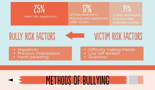
I’m adding this infographic to A Very, Very Beginning List Of The Best Resources On Bullying. I’m displaying it in a couple of ways because I like it a lot and want it to be accessible, but the original formatting is a bit “funky”:
You can see a better version here.
I’m adding this infographic to The Best Resources For World Literacy Day:

Here’s a nice infographic from Sarah Sparks at Education Week:
I think this infographic would be a useful one to show students prior to their creating one. I’m adding it to The Best Resources For Creating Infographics:

I’ve got to add this infographic to The Best Resources For “Moon Day”:

How Green Is My State? is a pretty cool interactive infographic giving assessments for each U.S. state on a number of environmental factors:

My Amazon Author’s page

Recent Comments